OVERVIEWBACKGROUNDPROBLEMDESIGN APPROACHSOLUTIONIMPACT

Expanded digital access to essential healthcare products for home delivery

An over-the-counter (OTC) digital ordering experience was designed to impact 6 million members of the pharmacy, providing access to health products without the process and need for a prescription. The effort expanded the pharmacy's digital service and capabilities, generating a new line of revenue and competitive edge for the business. For members of the pharmacy, it enabled discovery and access to essential health products, promoting proactive healthcare management. This initiative laid the foundation to scale the product across digital channels to reach and impact over 60 million eligible pharmacy members in future iterations, contributing to better health outcomes.
MY ROLE
Lead designer
RESPONSIBILITIES
UX strategy, UX/UI design, Interaction design, Visual design, Delivery
TIMELINE
3 months
BACKGROUND

Pharmacy home delivery

Home delivery was the digital pharmacy's core service, and it had been for as long as the business had started. It enabled customers, or existing account members, to order and manage prescriptions. All medications and health products required a prescription approval for pharmacy services to successfully process and ship orders.

Image of current product map
PROBLEM

A service gap

While the digital pharmacy had a well-established system, enabling users to effectively order and manage their prescriptions, it lacked a service to allow people to browse and order non-prescription health products for home delivery.

"I signed into my account. I got to view my scripts, however I wanted to check what was available for OTC items through the website. I could not see where to go from here."

Imagine being in a commercial retail pharmacy storefront. In the back corner is a pharmacy counter with pharmacists and technicians dispensing and transacting prescriptions with customers. A few feet away are 4-5 aisles with shelves stocked with pain relief, allergy, first-aid, and other health and wellness products, all commonly known as Over-the-Counter (OTC) products.

While big brand competitors in the industry offered digital OTC shopping experiences, our home delivery pharmacy service focused only on prescribed medications, leaving a gap in customer needs. To reach market parity and prioritize patient needs, the business looked to expand digital self-service and access to OTC products. My challenge was to design an end-to-end minimum viable product (MVP), featuring 40 products across five categories, allowing members to browse and shop products for home delivery benefits and services.

Image of over-the-counter products at a physical retail pharmacy
Commercial retail shopping for over-the-counter products
Image of a digital over-the-counter pharmacy experience on the CVS website
Example: online shopping for over-the-counter products
DESIGN APPROACH

Design goals and actions

I started my design process by first gathering the core requirements. At a baseline that entailed considering a total of 40 products under five categories, with expectations of product expansion and scalability over time. Each product required an image, client-informed rules such as set quantity limits, legal disclaimers, and a commercial price tag, all of which had to be factored into my design solutions. My execution strategy included the following:

  1. Reviewed competitors to see how big brands were presenting their over-the-counter shopping experiences. As a side note, the project timeline and budget did not allow for any formal research efforts, so this analysis served as an important reference for decision making throughout my process
  2. Created a high level product map to help facilitate stakeholder conversations and understand the product vision and identify end-to-end journey impacts and opportunities
  3. Conceptualized and wireframed the 0-1 over-the-counter MVP experience
  4. Engaged cross-functional partners to align on the design intent
  5. Refined the design experience to a high polish, readying it for development and release for 6 million people to discover it and use

Competitor evaluation

I looked at big box online shopping sites like Amazon, Walgreens, CostCo, Walmart, and CVS to see how they were presenting their shopping experiences. How did those brands lay out their shopping experience? What did those flows and key touchpoints look like? What digital capabilities and tools were available for use? How did they work? I collected snapshots of key UIs and found shared patterns across them that strongly suggested there were common conventions that I could reference and craft in the context of our digital pharmacy environment.

Image of competitor analysis of online shopping experiences across Amazon, Walgreens, CostCo, Walmart, and Cvs

Key takeaways

  • Grouping information into categories or departments is common and conventional for discoverability and navigation
  • Navigation patterns are consistent across sites, using breadcrumbs and pagination for intuitive wayfinding
  • Search and filter tools are heavily available to help discover and refine results
  • Product images are conventional patterns to engage and inform
  • Common flow across each site starts with broad/less information to detailed/more information, as one navigates from category/department to product details.

Facilitation, prioritization, and alignment across teams

Before diving into wireframing UIs, I created a visual product flowchart to facilitate and align with partners on a shared vision. My goal was to understand business goals, priorities, and impacted areas. Importantly, as lead designer, my goal was also to design a seamless end-to-end experience. So, mapping out to identify and socialize potential UX impacts early helped shape and influence the project's scope and direction, ensuring a user-centric approach. Not only that, starting with a high level map helped partners across teams see the breadth and depth of impacts and relationships beyond just the products they supported since different product teams handled different parts of a connected journey. Meanwhile, to a user it was all one experience, which was key in emphasizing during cross-team collaboration.

Image of a product flow including a new over-the-counter product experience

Early concepts, blockframes, and key journey touchpoints

Research across competitors and early design concepts helped me explore and define key user journey moments or touchpoints that would be critical for a MVP experience:

The previous checkout experience showing an overwhelming amount of tasks

Those product touchpoints included:

  • OTC Catalog that would serve as a landing page to introduce a suite of products for users to browse and get started from
  • Dedicated Category pages would that group similar types of products to help organize information to enable easy search, navigation, and discoverability
  • Product Details page for every product featured and available in order to give users more information and calls to action to place an order
SOLUTION

Discoverable and familiar, with scalability

I designed the foundation of an online shopping experience for 6 million users to browse and purchase healthcare products across categories like Allergy and Cold, Pain and Fever, Home Tests, Smoking Cessation, and Reproductive Health. This new 0-to-1 feature was seamlessly integrated into existing digital self-services and checkout capabilities for home delivery. A key factor in my success was staying committed to design goals that prioritized informed decisions and a user-centered experience. Three key questions consistently guided my process:
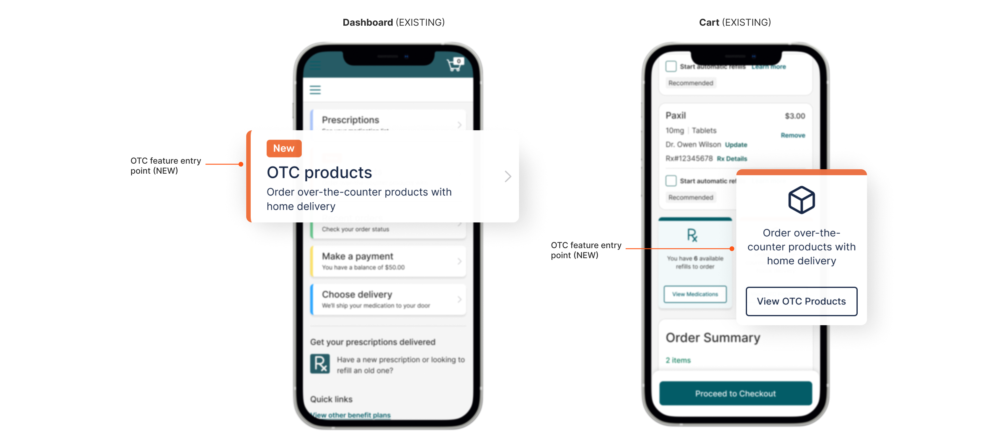
  1. Discoverability: How might we promote a new over-the-counter feature to ensure people discover and engage with it?
  2. Familiarity: How might we craft a new end-to-end experience that is intuitive and predictable so that people can effortlessly explore the feature?
  3. Scalability: How might we design an experience that can be flexible to allow building more products and capabilities over time?
Image of over-the-counter entry points on responsive web mobile experienceImage of over-the-counter key user interfaces including a catalog, categories, and product details page.
IMPACT

Digital access and home delivery services for improved health outcomes

The launch of the over-the-counter (OTC) minimum viable product was a highly anticipated expansion, bringing a new service to millions users. Despite minimal awareness efforts, like no supplemental marketing campaigns to drive traffic, we saw promising organic engagement within just two weeks.

For example, while a 2.2% click-thru rate and 1% conversion rate were not the highest, it aligned early expectations for an ecommerce experience where benchmarks usually range between 1-3%. Plus, 57.7% of first-time visitors returned to the OTC catalog landing page, indicating or suggesting a strong interest in product availability.

2.2%

Click-thru-rate
with no compaign

57.7%

Return sessions to
the OTC catalog

1%

Conversion

Beyond metrics, my design contributions helped to expand access to common healthcare products for home delivery, driving both better health outcomes and business growth. This work led to some key impacts and achievements, including:

  • Expanded pharmacy services to allow people to order health products without a prescription from a doctor, enabling proactive self-care and health management.
  • Delivered convenience and reliability for 6 million existing customers to access essential healthcare products, saving time with home delivery.
  • Helped the business drive new revenue and stay competitive by building a 0-1 new shopping flow for customers that was easily discoverable, familiar, and scalable.

Let's connect

I'm energized by good conversations, collaborating on ideas, and connecting on interests. Get in touch!
For questions
e-mail me
To network
LinkedIn
In the woodshop
Instagram